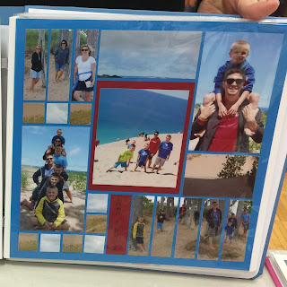
Ok, so I'm not a very good friend. In fact, I royally stink! I took some photos of some students' mosaics at a crop I attended on March 7, 2015 in Northern Kentucky. I had several folks bring me their pages and tell me that I had permission to share on my blog, but I have since lost the paper where I took down all the names that go with the pictures. If these are your mosaics, PLEASE send me a message so I can give you credit (and, as I like to say, make you "famous on the internet" - in a GOOD WAY)!
But for the rest of us, let's just focus on the spectacular job on these pages! I am absolutely in love with two features on the first layout. The first is the amazing way the stripes all come together and the second is the way she broke up the picture in the center of the layout, to allow the horizon to show at the top of the page.
The second one makes me happy because the student used the 4x4" RTC (ready to cut) grids as accents on a traditional 8.5x11 layout. I love the classic arrangement with the subjects in the upper left corner and lower right corner. The colors and lines are just all so perfect. It is both understated and sophisticated.


No comments:
Post a Comment